In the following code, it is shown that two different color scatter plots are drawn at the same time in the same coordinate system
import numpy as np
import matplotlib.pyplot as plt
from mpl_toolkits.mplot3d import Axes3D

#Generate random data
data1 = np.random.randint(30, 70, size=(30, 3)) #30*3 dimensional random integers of [30,70]
data2 = np.random.randint(10, 30, size=(40, 3)) #40*3 dimensions of [10, 30] random integers

x1 = data1[:, 0]
y1 = data1[:, 1]
z1 = data1[:, 2]

x2 = data2[:, 0]
y2 = data2[:, 1]
z2 = data2[:, 2]


# Plot a scatter plot
fig = plt.figure()
ax = Axes3D(fig)

'''
marker: shape, default round ball ('^' inverted triangle shape.)
c:color, default cyan

'''
ax.scatter(x1, y1, z1, c='r', marker = "^", label='red points')
ax.scatter(x2, y2, z2, c='g', label='green points')

# Plot the legend
ax.legend(loc='best')

# Add axes
ax.set_zlabel('Z Label', fontdict={'size': 15, 'color': 'red'})
ax.set_ylabel('Y Label', fontdict={'size': 15, 'color': 'red'})
ax.set_xlabel('X Label', fontdict={'size': 15, 'color': 'red'})
plt.show()
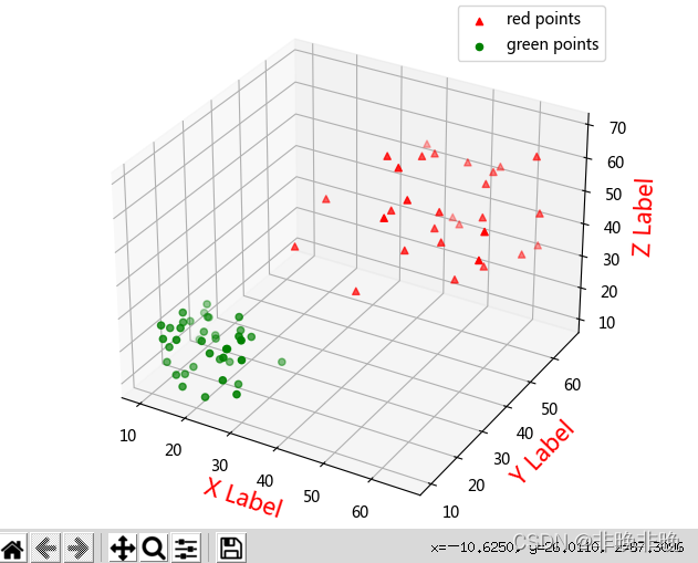
The results show that:
Read More:
- Echarts-for-React Example (Install, Import and Effect)
- Electron: How to Use BrowserWindow to Create a Window
- Open CASCADE Technology 7.7.0 released
- Canvas: How to Implement Video Screenshot Function
- Android: How to get the size of font you set (Example Code)
- Hutool Excel Import & Export Example
- MAFIA: 1- OpenFlow statistics (Counters, Timestamps)(mafia-sdn/p4demos/demos/1-openflow/1.1-statistics/p4src/of.p4)
- Windows Core Audio APIs: How to Progress Loopback Recording and Generate WAV File
- Android: How to Add Background Music for Activity with Service
- Base64 Image Compression Example
- Opentelemetry + Jaeger Python Version Cross Service Call Example
- WCNSS_qcom_cfg.ini WIFI Configuration File Guide
- How to Use Printf in HAL Library
- Flutter & Dart Enumeration Example
- Docker: How to build a rabbitmq image cluster
- MultipartFile Upload an Image Example
- Jquery use queue to implement Ajax request queue Simple Example
- go sync.Mutex Lock Examples
- Python: How to Create List by Comprehension (Example Codes)
- torch.max Example (How to Use)