The article directories
1. Import data; 2. Set error column; 3
+====================================================================================================================================+
1. Import data
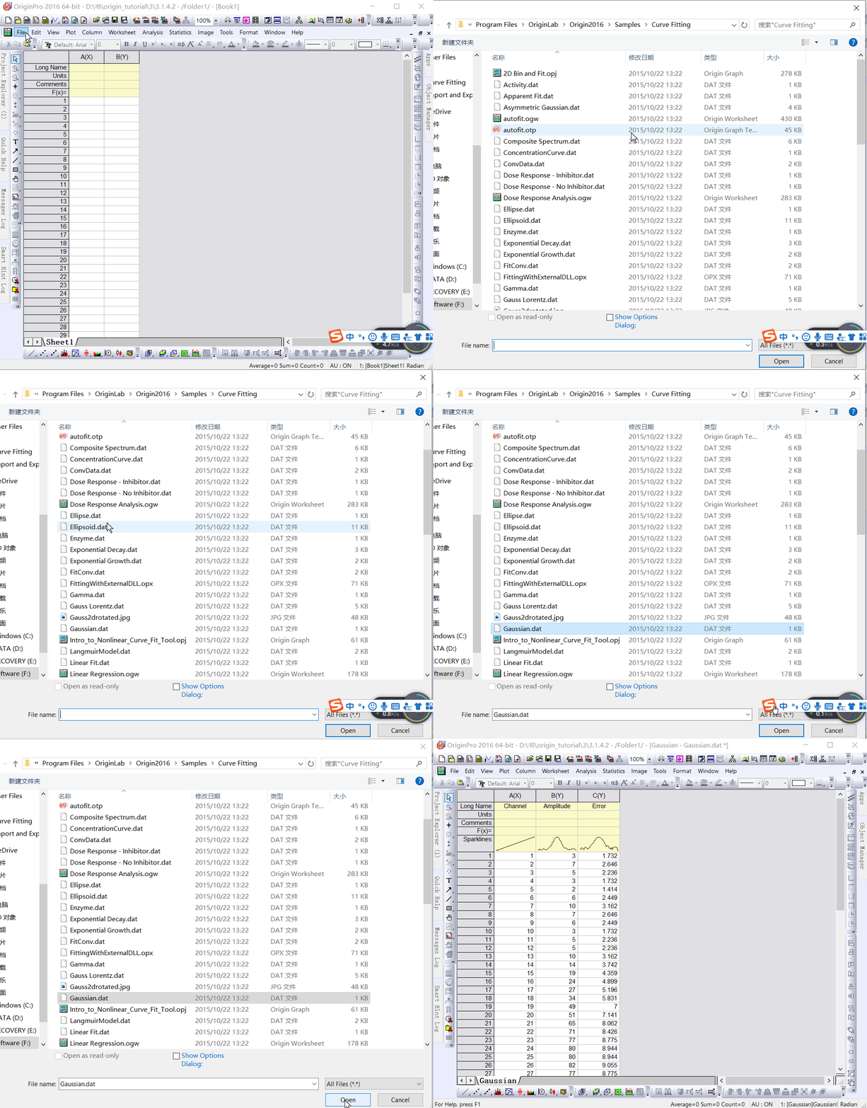
Select “File: Import: Single ASCII” to Open the “Open” dialog box. Browse \Samples\Curve Fitting subfolder. Highlight the file Gauss.dat and click the “Open” button to import the data into the original worksheet.

2. Set the error column
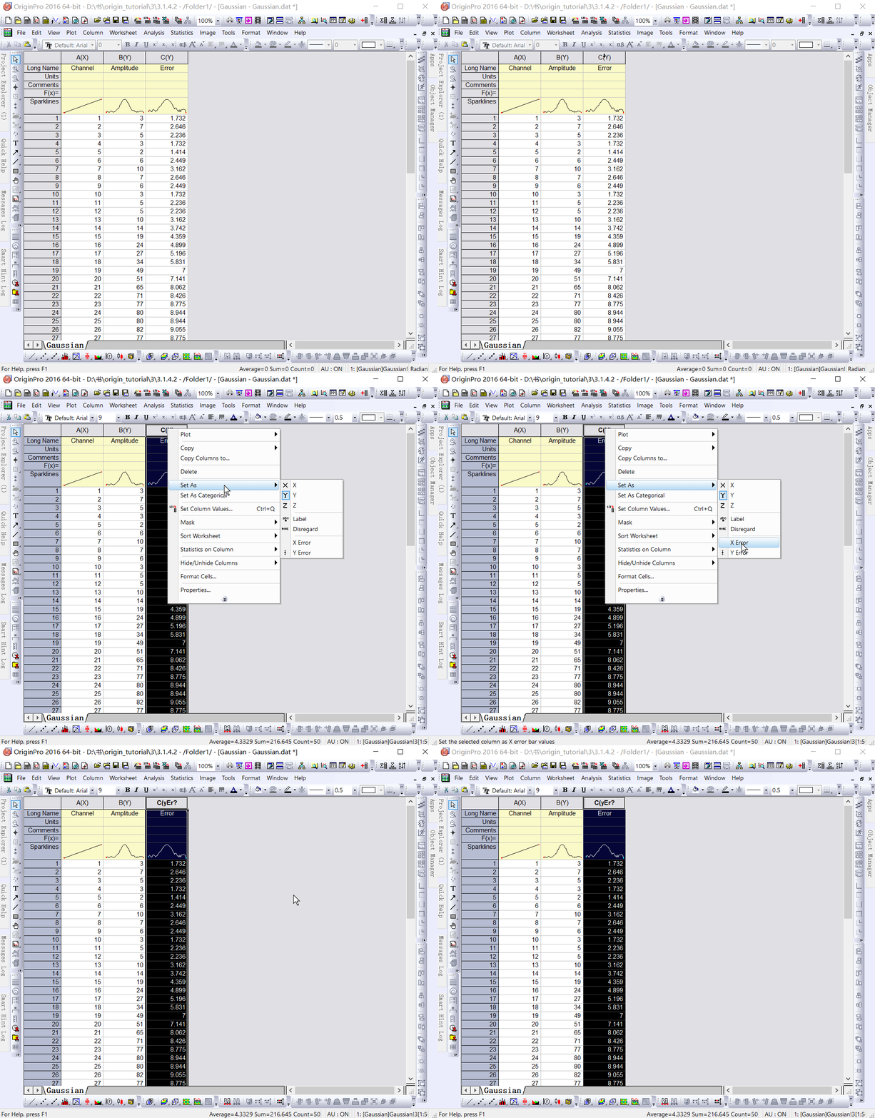
When imported, Sparklines automatically draws, allowing you to quickly see the shape of the data; The worksheet name will become the name of the file; Add a column to the worksheet as needed. As you can see from the Long Name, column 3 represents the data error. To Set this column to an Error column, click the column header to highlight it, right-click to bring up the pop-up menu, and then select “Set As: Y Error.

3. Draw images
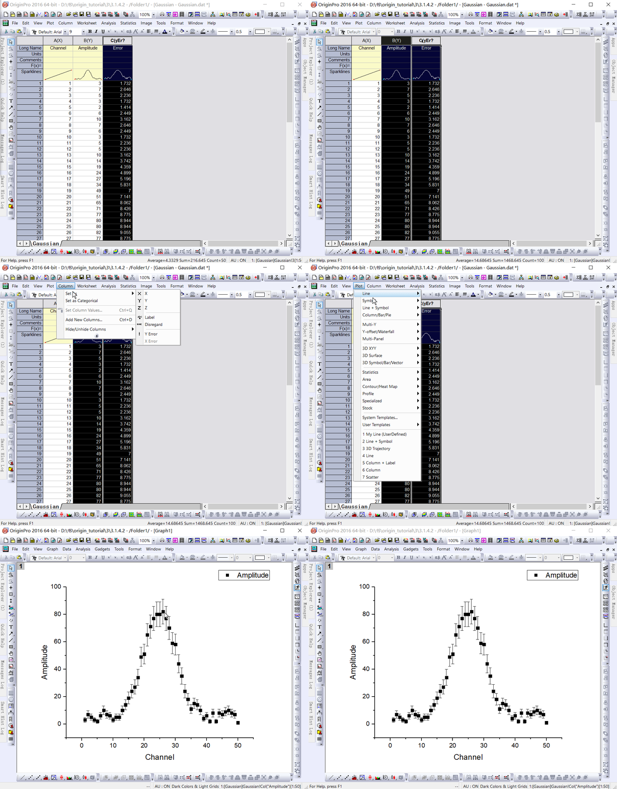
Mapping data in Origin is now easy; Highlight columns B and C (Y and Y errors), then select “Plot: Symbol: Scatter” from the menu to create a Scatter Plot with an error bar.

reference :Origin_Tutorial_2019_E