was made by two mistakes, one day —- in memory of myself, stupid, angry to death
the first stupid mistake is
**Computation failed in `stat_signif()`:not enough 'y' observations**
this tells “Y” that’s not right,,,,,, this error is the most stupid
this error is looking for different,,,,,,
this is my error, maybe the same error but the error is different
compaired <- list(c("A主枝","A侧枝"),
                           c("B主枝","B侧枝"),
                           c("C主枝","C测枝"),
                           c("D主枝","D侧枝"),
                           c("E主枝","E侧枝"),
                           c("F主枝","F侧枝"))
second error
Warning message:Removed 12 rows containing missing values (geom_signif).
and the reason why I made this error is because I wrote the y range wrong, so all the y values are in this range, but when you set the comparison,
geom_signif(comparisons = compaired,map_signif_level = T,test =t.test,step_increase = 0.0)
step_increase = 0.0 when it is not 0, it will also occupy a certain range of Y-axis, so y needs to be expanded
**
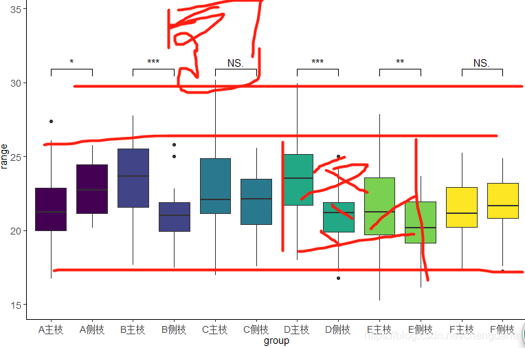
the third – — geom_signif function will not draw the histogram difference analysis directly between groups
**
— of course, the current understanding is not possible, I hope to know to tell you, of course, if you use the function after adding significance is possible, draw directly, like,,,,,
so I chose the boxplot, it is also good
** purpose: ** to compare whether there is a significant difference between the two data under each LABLE
LABLE
data reading
##install.packages("ggplot2")
library("ggplot2")
##install.packages("ggsignif")
library(ggsignif)
##读取数据
data <- read.table("clipboard",sep="\t",header = T,check.names=F)
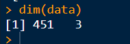
dim(data)
data[1:5,1:3]
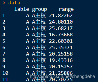
lable is divided into five classes group which is divided into two classes, to perform the difference significant comparison among each A, B, C and D
data type conversion
###转化因子
data$group <-factor(data$group,levels = unique(data$group),ordered = T)
data$lable <-factor(data$lable,levels = unique(data$lable),ordered = T)
##转换数值
data$range <- as.numeric(data$range)
division of the comparison group
compaired <- list(c("A主枝","A侧枝"),
                  c("B主枝","B侧枝"),
                  c("C主枝","C测枝"),
                  c("D主枝","D侧枝"),
                  c("E主枝","E侧枝"),
                  c("F主枝","F侧枝"))
was just used here, comparison of main and measured branches under different lable
+ A, B is for better comparison
Draw
p <- ggplot(data, aes(group, range,fill =lable)) +
      ###设置坐标,和分组
     geom_boxplot(show.legend = FALSE) +
     ###show.legend = FALSE  去除图例
     ylim(10, 40) +
     ##设置坐标轴Y的范围
     geom_signif(comparisons = compaired,map_signif_level = T,test =t.test,step_increase = 0.0)+
     ##geom_signif标注显著性——具体含义可以百度此函数
      ## wilcox.test——两种T测验根据正太检验决定
     theme_classic()+
     theme(axis.text.x=element_text(angle = 0,vjust =0.5,size=10.5),axis.text.y=element_text(size=10.5))+
     theme(axis.title.x =element_text(size=10.5), axis.title.y=element_text(size=10.5))
     ###设置刻度和标签字体等
p
Read More:
- Using greater than sign or less than sign to report error in mybatis
- Build your own resnet18 network and load torch vision’s own weight
- The difference between single equal sign and double equal sign EQ in shell script
- A PHP Error was encountered Severity: Warning Message: mysqli::real_connect(): Headers and client
- The solution of this. $message is not a function
- Git prompt this. $message is not a function?
- [How to Solve]Warning: connect.static is not a function
- Under Linux, git cannot be used, prompt sign_and_send_pubkey: signing failed: agent refused operation
- Gcc compiler warning solution: “extra tokens at end of ifndef directive” Tags: GCC, warning
- Mmdetection reports an error when running its own coco dataset. Does not match the length of \ ` classes \ ` 80) in cocodataset
- command/usr/bin/codesign failed with exit code 1- code sign error
- Failed to execute goal org.apache.maven.plugins:maven-gpg-plugin:1.6:sign
- After JQ gets the tag element itself, it gets its own HTML text format (find only finds one level of child elements)
- Deep learning: derivation of sigmoid function and loss function
- Golang timer function executes a function every few minutes
- Python – get the information of calling function from called function
- Ioremap function and iounmap() function
- Tensorflow error record: depreciation warning: elementwise
- Encounter the situation of convergence warning
- windows live mail error message