for example:
<!DOCTYPE html>
<html lang="en">
<head>
    <meta charset="UTF-8">
    <meta name="viewport" content="width=device-width, initial-scale=1.0">
    <title>Document</title>
    <style>
        *{
            padding: 0;
        }
        ul{
            width: 400px;
            height: 300px;
            background-color: #ccc;
        }
        ul>li{
            width: 100px;
            height: 100px;
            background-color: red;
            list-style: none;
        }
    </style>
</head>
<body>
    <ul>
        <li></li>
    </ul>
</body>
</html>
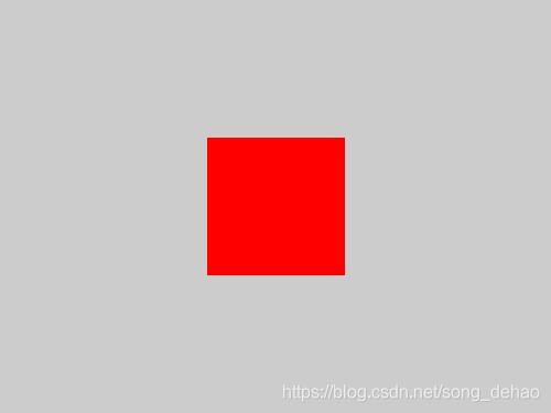
results as shown in the figure below,

method:
makes ul relatively positioned and li absolutely positioned, in two ways
        ul{
            position: relative;
        }
        ul>li{
            position: absolute;
            /*1*/
            margin: auto;
            top: 0;
            right: 0;
            bottom: 0;
            left: 0;
            /*2、 或者直接使用如下top和left */
            top:100px;/*父元素高度减子元素的高度的一半*/
            left: 150px;/*父元素宽度减子元素的宽度的一半*/
        }
results as shown below
Set ul display:flex
        ul{
            display: flex;
            justify-content: center;
            align-items: center;
        }
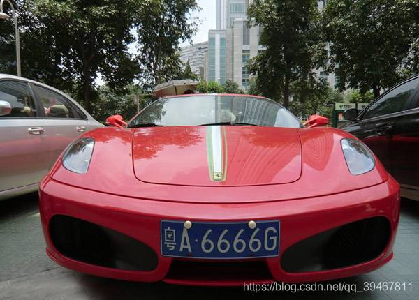
Simple license plate recognition based on Halcon
simple license plate recognition
Graph
- code
- results
-
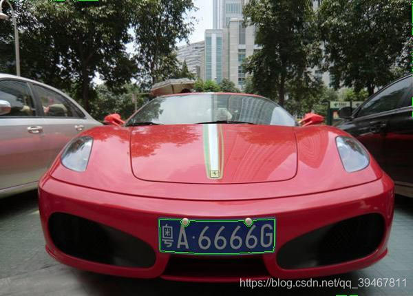
- positioning location results
- recognition results
original
code
dev_close_window ()
*车牌定位及倾斜旋转
read_image (Car, 'E:/Halcon_Learn/car.jpg')
get_image_size (Car, Width, Height)
dev_open_window (0, 0, Width, Height, 'black', WindowHandle)
dev_set_color ('green')
dev_set_line_width (3)
decompose3 (Car, Image1, Image2, Image3)
threshold (Image1, Regions, 0, 31)
connection (Regions, ConnectedRegions)
select_shape (ConnectedRegions, SelectedRegions, 'area', 'and', 4636.72, 5508.59)
dilation_circle (SelectedRegions, RegionDilation, 3.5)
erosion_circle (RegionDilation, RegionErosion, 3.5)
fill_up (RegionErosion, RegionFillUp)
orientation_region (RegionFillUp, Phi)
area_center (RegionFillUp, Area, Row, Column)
vector_angle_to_rigid (Row, Column, Phi, Row, Column, rad(180), HomMat2D)
affine_trans_image (Car, ImageAffineTrans, HomMat2D, 'constant', 'false')
affine_trans_region (RegionFillUp, RegionAffineTrans, HomMat2D, 'nearest_neighbor')
reduce_domain (ImageAffineTrans, RegionAffineTrans, ImageReduced)
*显示定位车牌
dev_display (ImageAffineTrans)
overpaint_region (ImageAffineTrans, RegionAffineTrans, [0,255,0], 'margin')
dump_window_image (Image_define, WindowHandle)
write_image (Image_define, 'jpg', 0, 'E:/Halcon_Learn/car_define')
stop ()
*字符分割
rgb1_to_gray (ImageReduced, GrayImage)
invert_image (GrayImage, ImageInvert)
threshold (GrayImage, Regions1, 61, 126)
connection (Regions1, ConnectedRegions1)
select_shape (ConnectedRegions1, SelectedRegions1, ['area','height'], 'and', [219,31.607], [321.78,40.742])
sort_region (SelectedRegions1, SortedRegions, 'character', 'true', 'row')

*字符识别
read_ocr_class_mlp ('Industrial_0-9A-Z_NoRej.omc', OCRHandle)
do_ocr_multi_class_mlp (SortedRegions, ImageInvert, OCRHandle, Class, Confidence)

*显示
smallest_rectangle1 (SortedRegions, Row1, Column1, Row2, Column2)
count_obj (SortedRegions, Number)
dev_display (Car)
for i := 1 to Number by 1
   * disp_message (WindowHandle, Class[i-1], 'window', Row2[i-1], Column1[i-1], 'red', 'false')
     set_tposition (WindowHandle, Row2[i-1], Column1[i-1])
     write_string (WindowHandle, Class[i-1])
endfor

dump_window_image (Image, WindowHandle)
write_image (Image, 'jpg', 0,'E:/Halcon_Learn/car_result')
Results the
positioning result
recognition result
