The article directories
1. Import data; 2. Set error column; 3
+====================================================================================================================================+
1. Import data
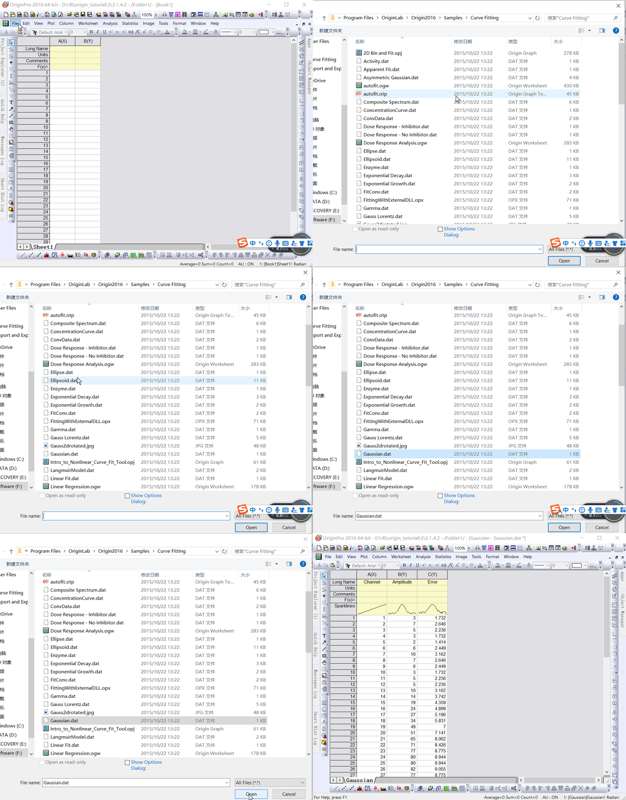
Select “File: Import: Single ASCII” to Open the “Open” dialog box. Browse \Samples\Curve Fitting subfolder. Highlight the file Gauss.dat and click the “Open” button to import the data into the original worksheet.

2. Set the error column
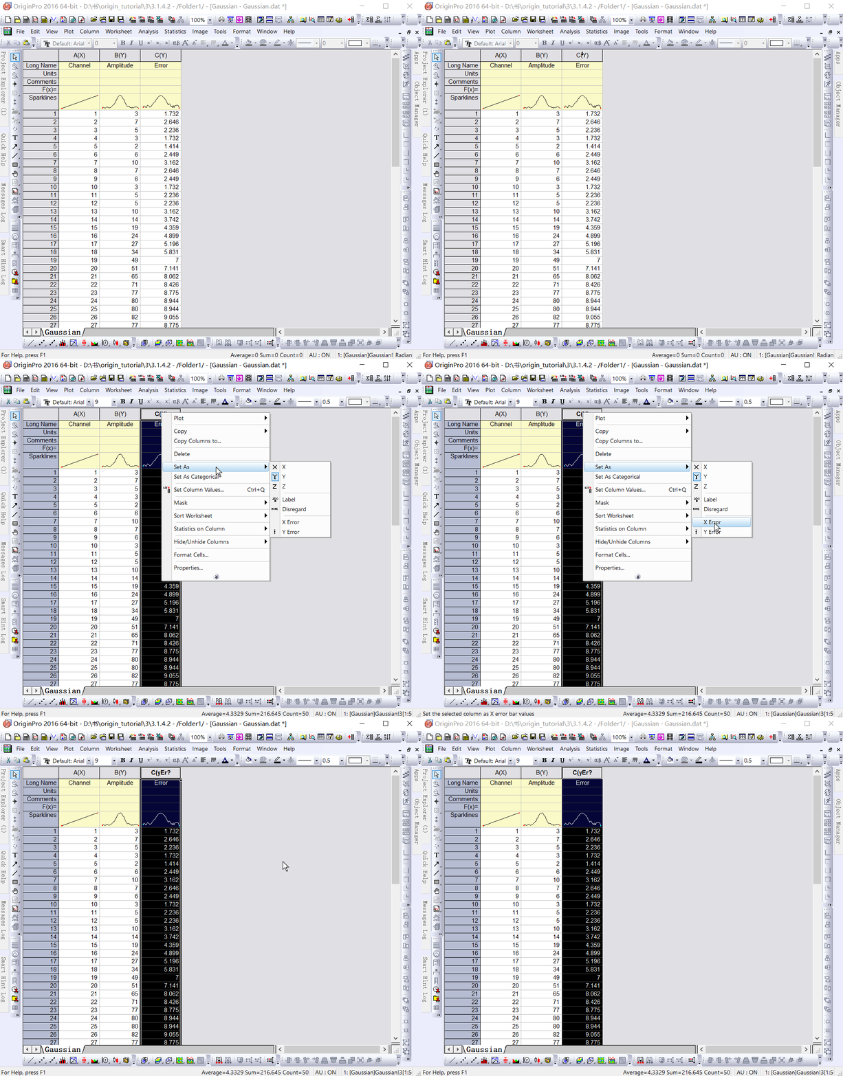
When imported, Sparklines automatically draws, allowing you to quickly see the shape of the data; The worksheet name will become the name of the file; Add a column to the worksheet as needed. As you can see from the Long Name, column 3 represents the data error. To Set this column to an Error column, click the column header to highlight it, right-click to bring up the pop-up menu, and then select “Set As: Y Error.

3. Draw images
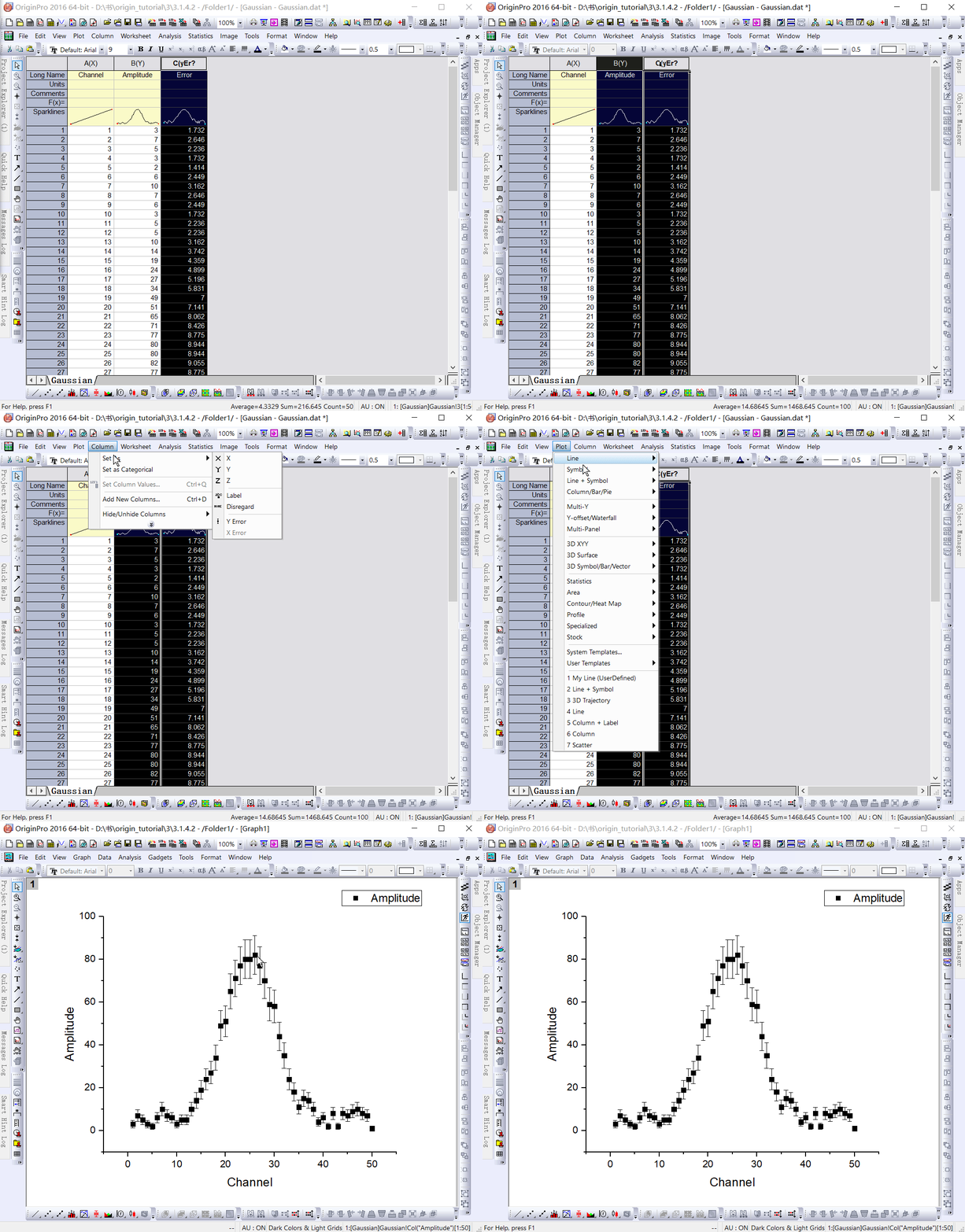
Mapping data in Origin is now easy; Highlight columns B and C (Y and Y errors), then select “Plot: Symbol: Scatter” from the menu to create a Scatter Plot with an error bar.

reference :Origin_Tutorial_2019_E
Read More:
- Matlab realization of user-defined curve and legend
- Matlab draw logarithmic coordinates!
- Python — using Matplotlib to draw histogram
- Cross origin requests are only supported for
- Solved: No’Access-Control-Allow-Origin’ cross-domain issue
- [181124] VC + + use OpenGL to draw 3D graphics example source code
- 1 vs20152017 + OpenGL to configure and draw a white rectangle
- Solution of no response of progress bar in MFC program
- How does lightningchart, a high performance chart control, draw maps in 3D?
- Visual slam Lesson 6: curve fitting with g2o, error: cmake error at CMakeList.txt (find_ package) By not providing“FindG2O.cmake“
- Two methods of fixing WPF menu bar after scrolling to the top
- Failed to execute ‘postMessage’ on ‘DOMWindow’: The target origin provided (‘https://xxx.cn’) does n
- Error report after solving git push origin master
- Get the height of mobile phone status bar through reflection
- Position change of Ubuntu menu bar (left, bottom)
- AttributeError:‘AxesSubplot’object has no attribute‘bar_label’
- Windows solution enabled visdom.server Slow and blank blue screen (no navigation bar)
- The Ubuntu status bar shows the network speed, memory and CPU utilization ratio
- Error: pathspec ‘origin / xxx’ did not match any file (s) known to GIT
- Git solves pull origin error: the following untracked working tree files would be rewritten by merge