Practice ING – Frame animation to achieve special effects
Recently, I wrote another requirement, which used a lot of CSS3 animation, but it is still very deep to go into each attribute of CSS3 animation carefully. Here, I will write down the understanding of the steps attribute of frame animation
We know that CSS3 Animation has eight attributes
animation-name
animation-duration
animation-delay
animation-iteration-count
animation-direction
animation-play-state
animation-fill-mode
animation-timing-function
Most 1-7 are introduced, but the animation-timing function is an attribute that controls the time
In addition to the three Bessel curves commonly used, there is the confusing steps() function
By default, the animation ease the transition. It inserts a tween between each key frame, so the animation is coherent
In addition to ease, transition functions such as Linear, Cubic – Bezier will insert the tween for it. However, some effects do not require tween, but only a jump between key frames, where steps should be used
Understand the steps
The Steps function specifies a step function
The first parameter specifies the number of intervals in the time function (must be positive integers)
The second parameter, which is optional, accepts both start and end values, specifying a step change at the start or end point of each interval, which defaults to end.
Step -start is equal to steps(1,start). The animation is divided into 1 step. The part that starts the left endpoint when the animation is executed is the beginning.
Step-end is the same as steps(1,end) : the animation is divided into steps, and the animation is executed starting with the end endpoint, with the default value of end.
Look at the W3C specification
The wrong understanding of the first parameter of steps:
Steps (5, start)
The first parameter “number” of steps() is the specified number of intervals, that is, the animation is divided into N-step phased display, which is estimated to be the number of changes written for keyframes by most people
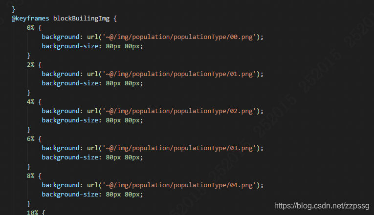
A look at the cSS2 frame animation I wrote also gave me a good understanding of cSS3 animation
@-webkit-keyframes circle {
0% {}
25%{}
50%{}
75%{}
100%{}
}

I also wrote a js, please refer to
